Measuring usability to reduce cognitive load in cardiac ablation procedures
Designing and validating an AI interface to support electrophysiologists in high-stakes environments
Volta develops an AI-powered decision-support interface for electrophysiologists performing cardiac ablation procedures — complex interventions aimed at reducing the risk of atrial fibrillation. During these procedures, physicians rely on intra-cardiac mapping catheters and real-time signal analysis to identify abnormal zones.
When I joined Volta’s R&D team as Senior Product Designer, the company faced a new challenge: a technical breakthrough allowed the system to display up to 48 signal channels instead of the usual 10. The opportunity promised greater diagnostic precision — but also raised a critical question: could physicians handle this increase without cognitive overload in the operating room?
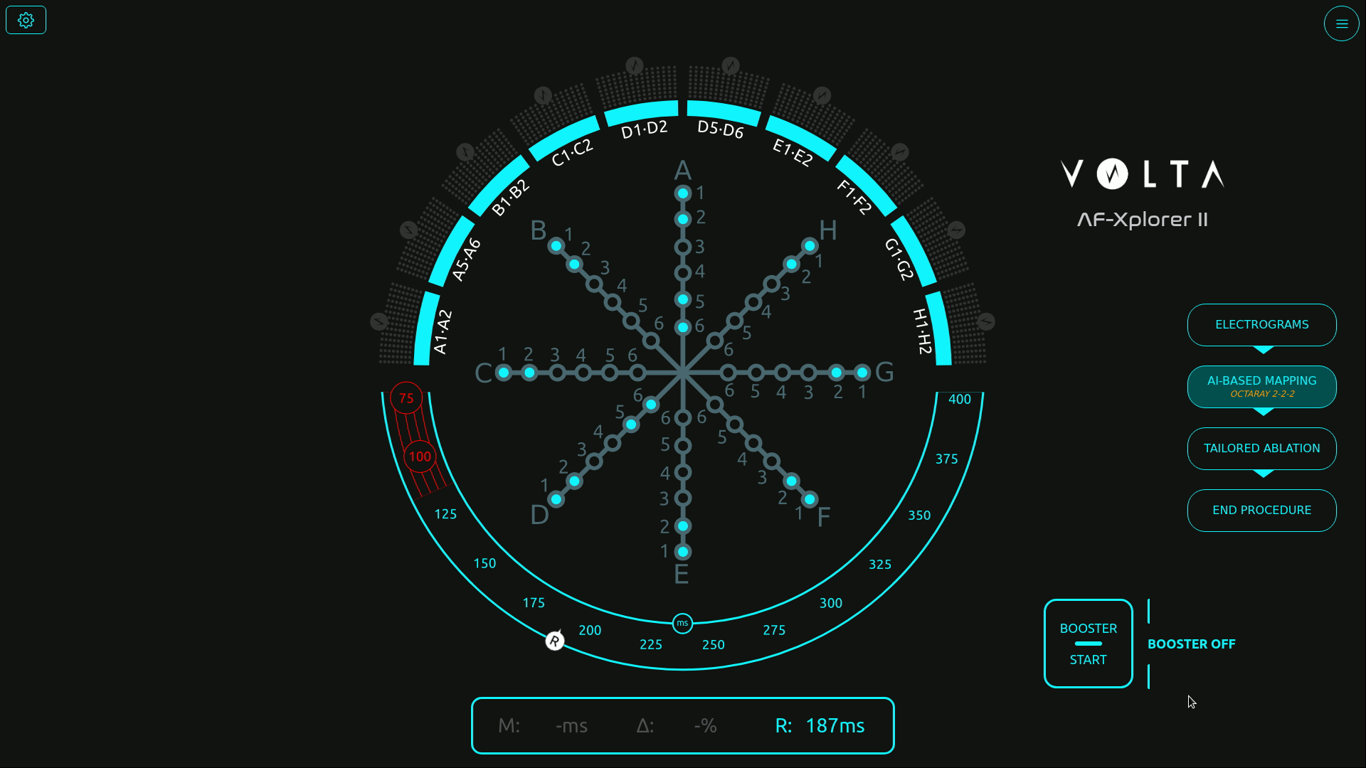
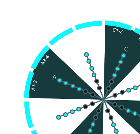
Initial screen with the catheter schematic in the center
Structuring usability testing for medical-grade reliability
Before my arrival, formative and summative tests were already part of Volta’s medical device procedures — but they were conducted in a “quick and dirty” fashion, without clear metrics or structured methodology.
As Senior Product Designer, I took the lead in formalizing and structuring these usability practices to make them measurable, repeatable, and clinically reliable.
Working closely with AI engineers, physicians, the product manager, and the regulatory team, I designed a testing protocol aligned with both medical device compliance and UX research standards.
Because testing in a real surgical environment was not possible, I created realistic interactive prototypes in Figma, faithfully replicating Volta’s interface behavior and visual dynamics.
This setup enabled controlled usability simulations, measuring how interface complexity and signal density impacted perception, attention, and coordination under time pressure.
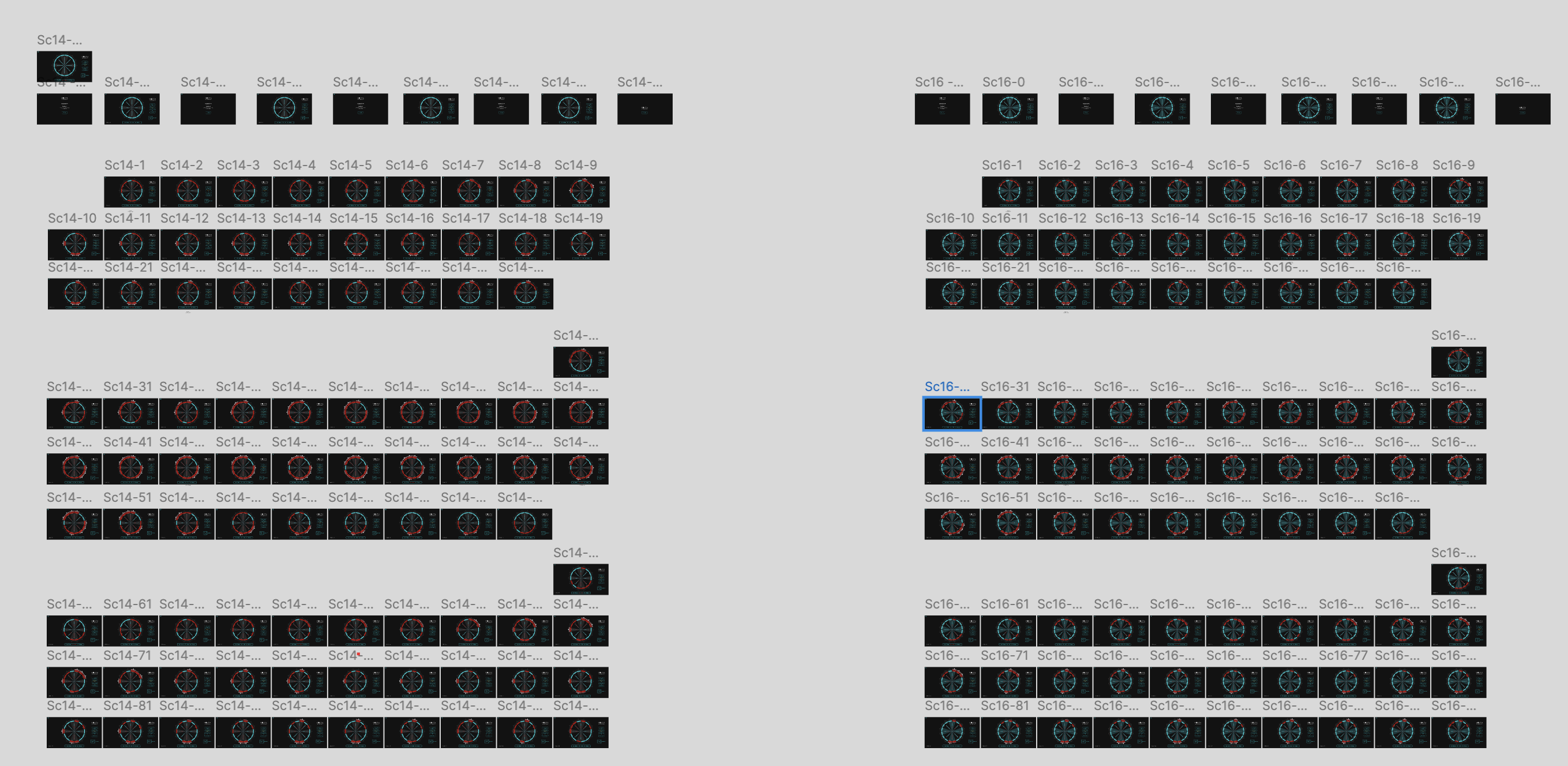
Scenarios file in Figma
Visual exploration
Designing simulations to measure perception, attention, and coordination
We built a simulation protocol inspired by Measuring the User Experience (Tullis & Halbert), defining clear performance indicators such as:
- Detection errors (missed visual signals)
- Announcement errors (verbal communication issues between physician and mapping engineer)
- Input errors (incorrect tagging in the mapping software)
Each simulation progressively increased the number of signal channels — from 10 to 24 — to evaluate the tipping point where the interface would become cognitively overwhelming.
Over 15 simulation sessions involving 18 participants (physicians, mapping engineers, and clinical specialists), we captured both quantitative performance data and qualitative feedback on visual comfort and workload.
Sessions were recorded, coded, and analyzed to identify cognitive breakdowns and determine an optimal usability threshold.
Example of simulation session
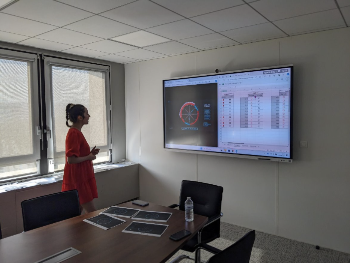
Session with a participant
Finding the threshold — balancing precision and usability
The data revealed a clear limit: beyond 16 channels, both signal detection accuracy and communication between the physician and the engineer began to deteriorate.Stress indicators and confusion increased sharply past that threshold, confirming that more data did not mean better decision-making.
Physicians unanimously favored the 16-channel configuration, which provided sufficient signal coverage without compromising focus or workflow continuity.
“With too many channels, we lose focus and forget what was already called out,” one physician said during the tests.
This insight led to a decisive design recommendation: limit the interface display to 16 channels for clinical use. That configuration is now part of the commercial product deployed in hospitals, praised by physicians for maintaining both precision and clarity.
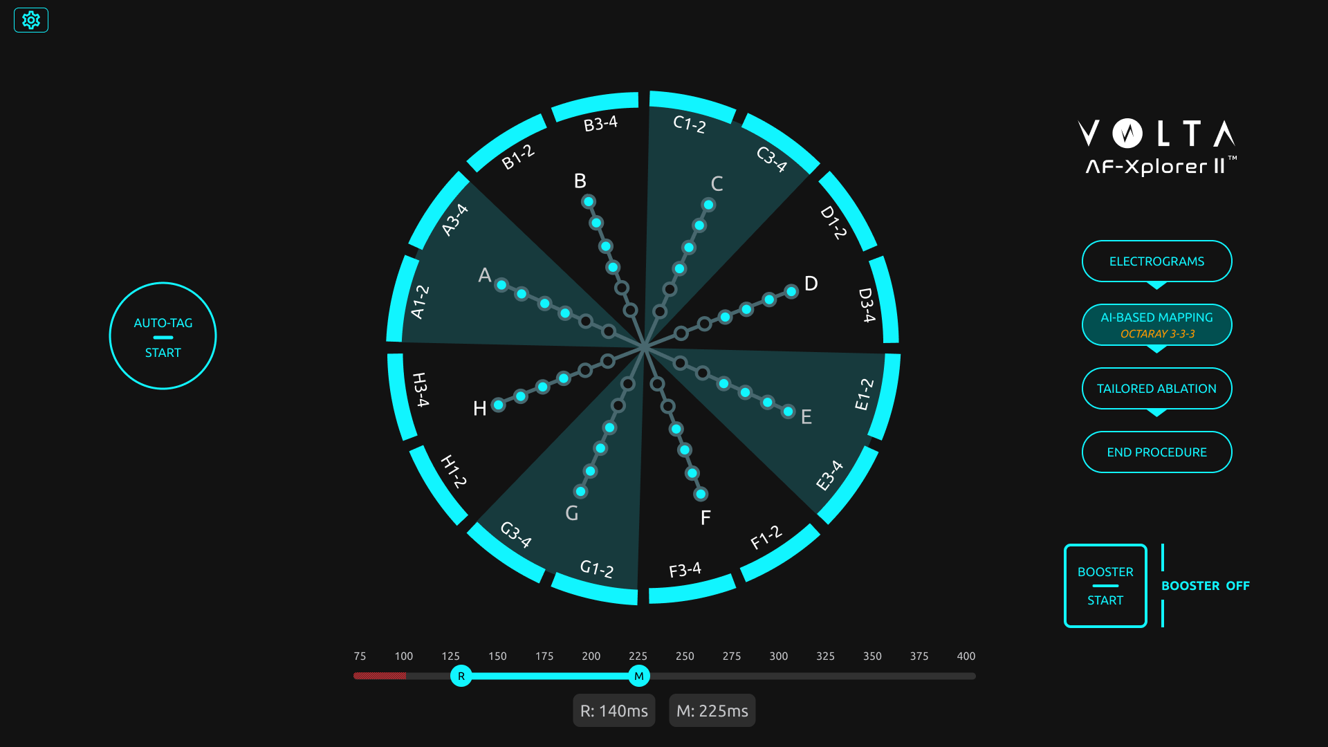
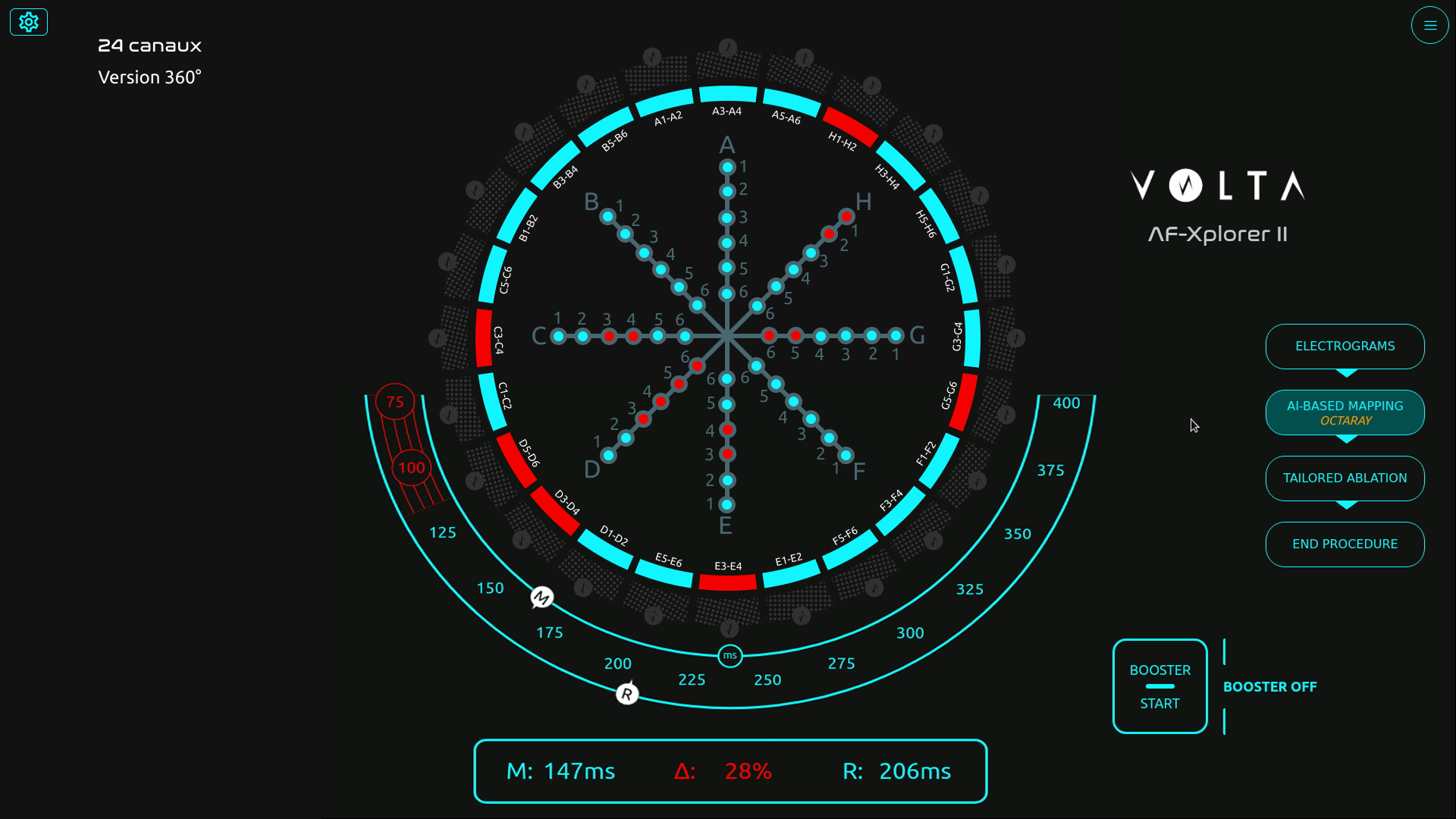
Final screen with 16 channels
Building design maturity inside the R&D team
Beyond the test results, the project became a turning point for Volta’s design maturity.
Starting from a blank slate, I introduced Figma as a design and prototyping tool, built a component library to quickly replicate test scenarios, and trained engineers and PMs in usability testing methods.
I also helped the regulatory team integrate this new process into Volta’s documentation framework, bridging user experience validation and medical compliance.
Despite limited resources and physician availability, this approach de-risked the interface before release and established a shared understanding of design’s value in product reliability.
🌟 Impact
The project had a lasting impact across product, clinical, and organizational dimensions:
- Adoption of the 16-channel configuration, now a validated standard in Volta’s system.
- Higher user satisfaction and reduced cognitive stress in clinical feedback.
- Redesign of the main operating-room interface, improving usability and adoption of underused components.
- Establishment of Volta’s usability testing culture, making design a key contributor to R&D decision-making.
Volta Medical
Structuring
a product team


Product Team
Volta Medical
Building product maturity through feedback culture, measurable goals, and Product Ops coaching
Volta Medical
Measuring usability
for an AI interface
Medical Device
Volta Medical
Designing and validating an AI interface to support electrophysiologists in high-stakes environments
France Travail
Alignment within a fragmented public organization


Suivi de Parcours
France Travail
Using design strategy to connect policy ambitions with field realities in the creation of France Travail
AI Predictions
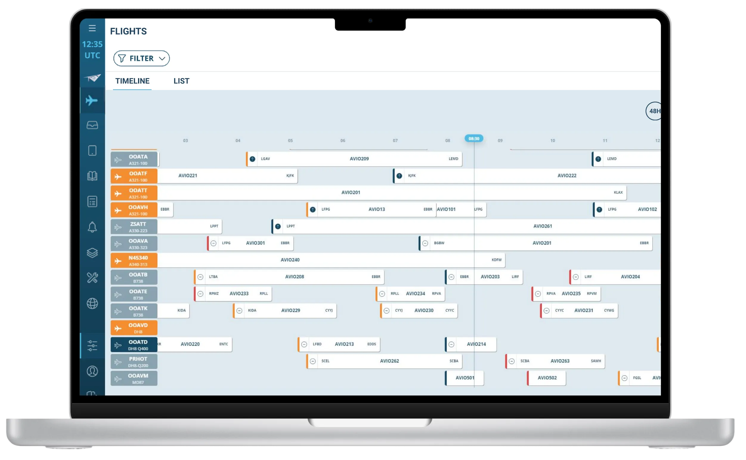
FlytWise
AI Assistant
Thales Avionics
Turning user research and market insights into a strategic product roadmap

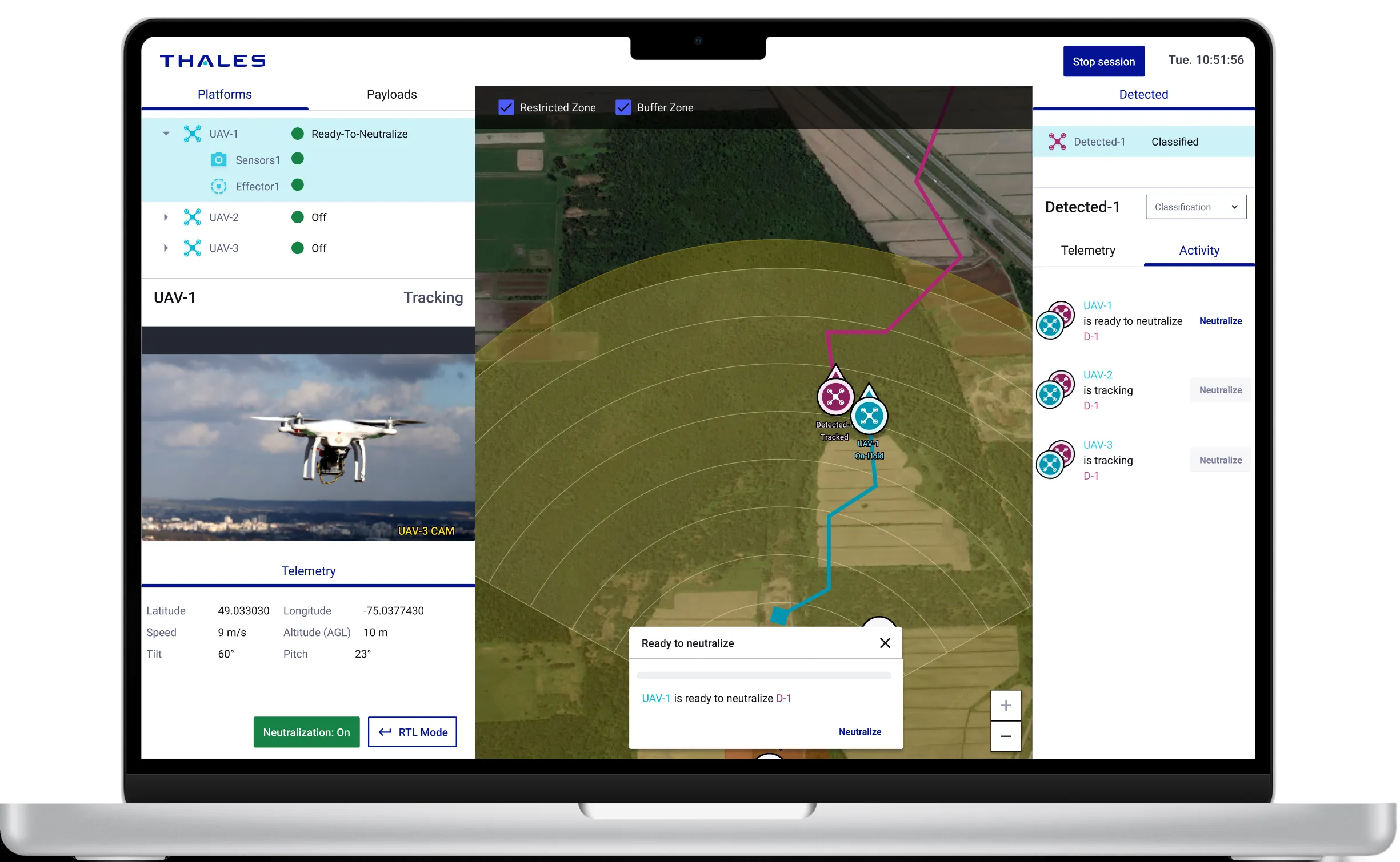
BlueSwarm
Autonomous drone
UI Command &Control
Blue Swarm
Thales Digital Solutions
Demonstrate how an operator can supervise an autonomous counter-drone defence system
Sleevi
Track fatigue
in real-time
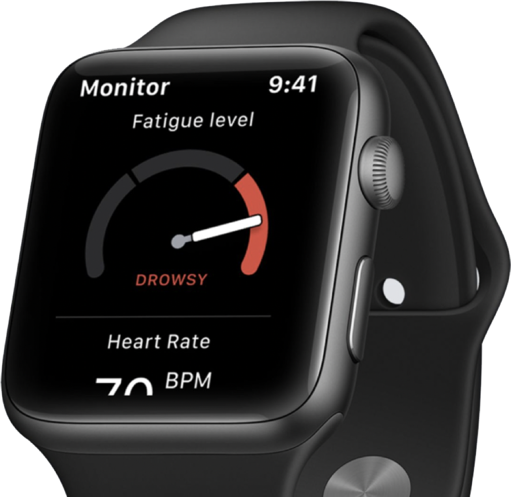

Fatigue Monitoring App
Thales Digital Factory
Helping pilots understand and act on their fatigue — and increasing user retention by 40%
BetterFly
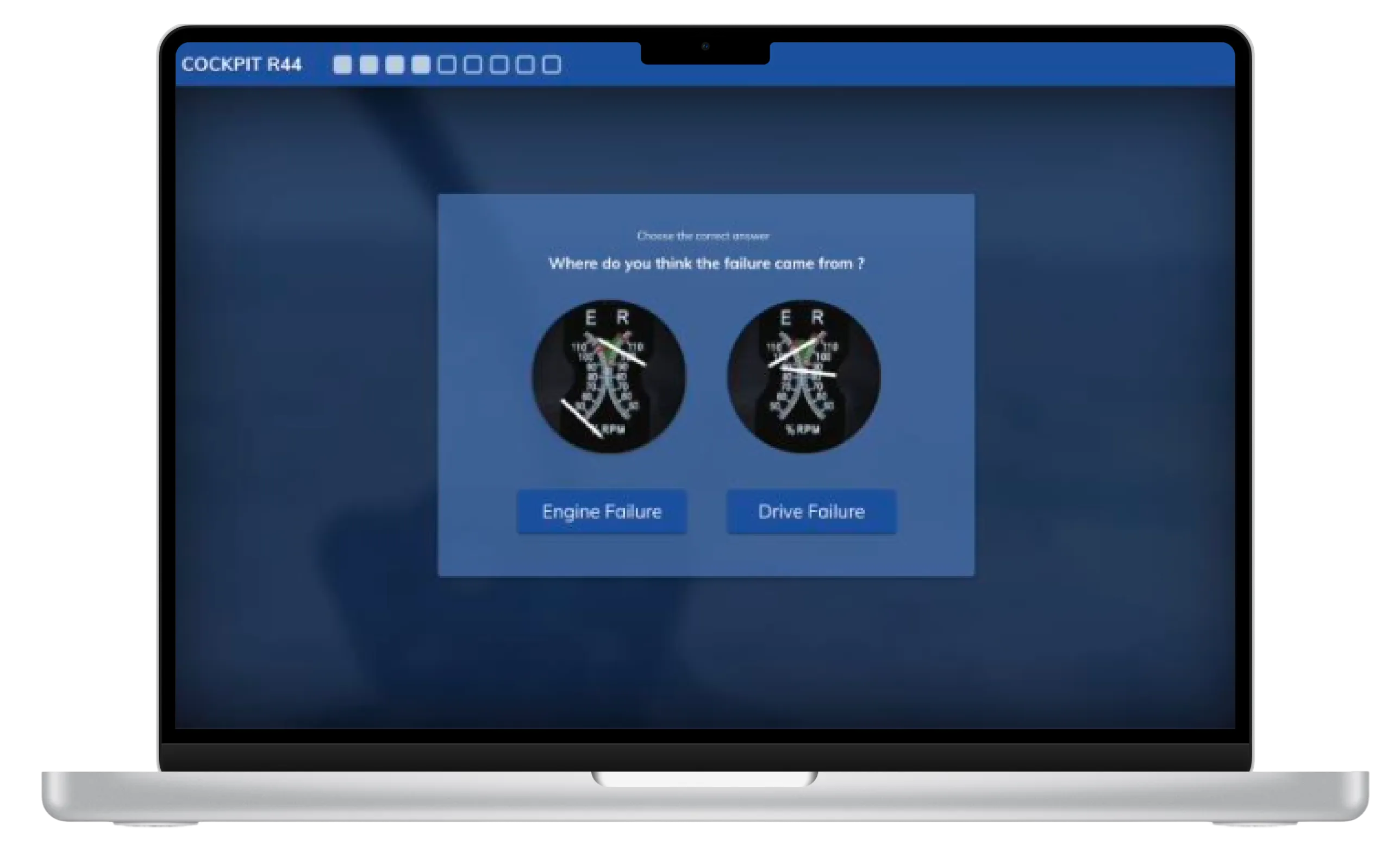
Review
helicopter emergency procedures
Betterfly
Thales Digital Factory
Testing the value of a web-based learning platform enabling helicopter pilots to review emergency procedures
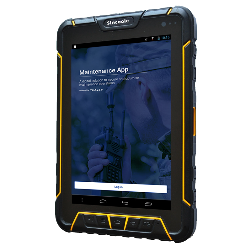
Maintenance App
Improve tracking and repair of radio equipment
Maintenance App
Thales Communications
Help operator improve tracking of radio equipment
Measuring usability
User research, PRODUCT DESIGN
Measuring usability to reduce cognitive load in cardiac ablation procedures
Designing and validating an AI interface to support electrophysiologists in high-stakes environments
Volta develops an AI-powered decision-support interface for electrophysiologists performing cardiac ablation procedures — complex interventions aimed at reducing the risk of atrial fibrillation. During these procedures, physicians rely on intra-cardiac mapping catheters and real-time signal analysis to identify abnormal zones.
When I joined Volta’s R&D team as Senior Product Designer, the company faced a new challenge: a technical breakthrough allowed the system to display up to 48 signal channels instead of the usual 10. The opportunity promised greater diagnostic precision — but also raised a critical question: could physicians handle this increase without cognitive overload in the operating room?
Initial screen with the catheter schematic in the center
Structuring usability testing for medical-grade reliability
Before my arrival, formative and summative tests were already part of Volta’s medical device procedures — but they were conducted in a “quick and dirty” fashion, without clear metrics or structured methodology.
As Senior Product Designer, I took the lead in formalizing and structuring these usability practices to make them measurable, repeatable, and clinically reliable.
Working closely with AI engineers, physicians, the product manager, and the regulatory team, I designed a testing protocol aligned with both medical device compliance and UX research standards.
Because testing in a real surgical environment was not possible, I created realistic interactive prototypes in Figma, faithfully replicating Volta’s interface behavior and visual dynamics.
This setup enabled controlled usability simulations, measuring how interface complexity and signal density impacted perception, attention, and coordination under time pressure.
Scenarios file in Figma
Visual exploration
Designing simulations to measure perception, attention, and coordination
We built a simulation protocol inspired by Measuring the User Experience (Tullis & Halbert), defining clear performance indicators such as:
- Detection errors (missed visual signals)
- Announcement errors (verbal communication issues between physician and mapping engineer)
- Input errors (incorrect tagging in the mapping software)
Each simulation progressively increased the number of signal channels — from 10 to 24 — to evaluate the tipping point where the interface would become cognitively overwhelming.
Over 15 simulation sessions involving 18 participants (physicians, mapping engineers, and clinical specialists), we captured both quantitative performance data and qualitative feedback on visual comfort and workload.
Sessions were recorded, coded, and analyzed to identify cognitive breakdowns and determine an optimal usability threshold.
Example of simulation session
Session with a participant
Finding the threshold — balancing precision and usability
The data revealed a clear limit: beyond 16 channels, both signal detection accuracy and communication between the physician and the engineer began to deteriorate.Stress indicators and confusion increased sharply past that threshold, confirming that more data did not mean better decision-making.
Physicians unanimously favored the 16-channel configuration, which provided sufficient signal coverage without compromising focus or workflow continuity.
“With too many channels, we lose focus and forget what was already called out,” one physician said during the tests.
This insight led to a decisive design recommendation: limit the interface display to 16 channels for clinical use. That configuration is now part of the commercial product deployed in hospitals, praised by physicians for maintaining both precision and clarity.
Final screen with 16 channels
Building design maturity inside the R&D team
Beyond the test results, the project became a turning point for Volta’s design maturity.
Starting from a blank slate, I introduced Figma as a design and prototyping tool, built a component library to quickly replicate test scenarios, and trained engineers and PMs in usability testing methods.
I also helped the regulatory team integrate this new process into Volta’s documentation framework, bridging user experience validation and medical compliance.
Despite limited resources and physician availability, this approach de-risked the interface before release and established a shared understanding of design’s value in product reliability.
🌟 Impact
The project had a lasting impact across product, clinical, and organizational dimensions:
- Adoption of the 16-channel configuration, now a validated standard in Volta’s system.
- Higher user satisfaction and reduced cognitive stress in clinical feedback.
- Redesign of the main operating-room interface, improving usability and adoption of underused components.
- Establishment of Volta’s usability testing culture, making design a key contributor to R&D decision-making.
Volta Medical
Structuring a product team
Product Team
Volta Medical
Building product maturity through feedback culture, measurable goals, and Product Ops coaching
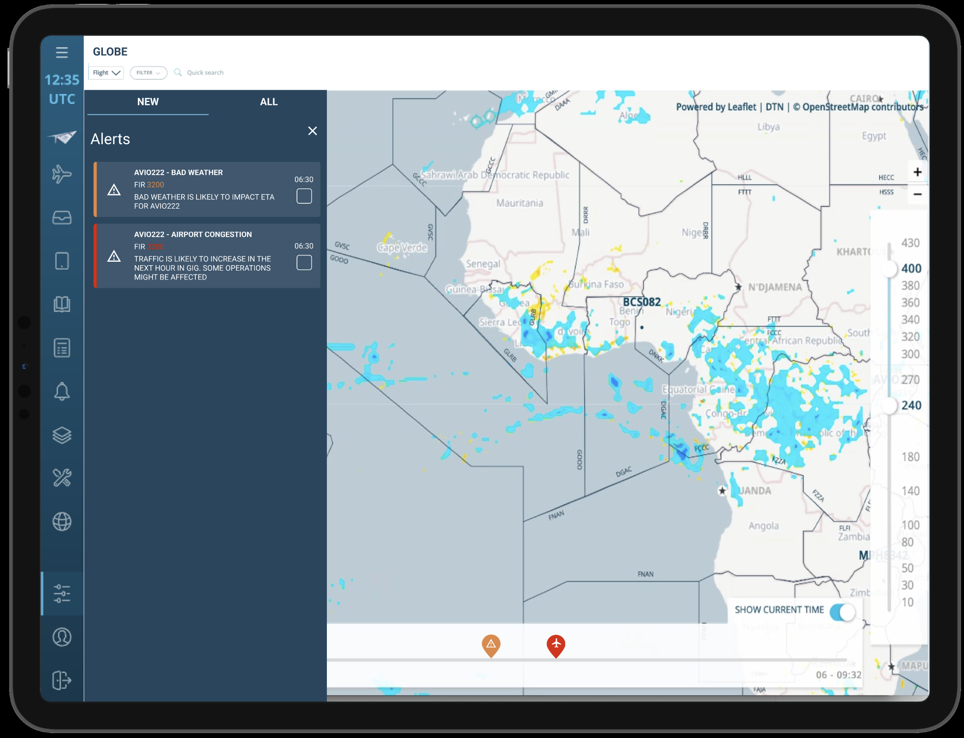
FlytWise
AI Predictions
AI Assistant
Thales Avionics
Turning user research and market insights into a strategic product roadmap
Volta Medical
Measuring usability
for an AI interface
Medical Device
Volta Medical
Designing and validating an AI interface to support electrophysiologists in high-stakes environments
BlueSwarm
Autonomous drone
UI Command &Control
Blue Swarm
Thales Digital Solutions
Demonstrate how an operator can supervise an autonomous counter-drone defence system
Sleevi
Track fatigue
in real-time
Fatigue Monitoring App
Thales Digital Factory
Helping pilots understand and act on their fatigue — and increasing user retention by 40%
BetterFly
Review
helicopter emergency procedures
Betterfly
Thales Digital Factory
Testing the value of a web-based learning platform enabling helicopter pilots to review emergency procedures
Maintenance App
Improve tracking and repair of radio equipment
Maintenance App
Thales Communications
Help operator improve tracking of radio equipment
France Travail
Alignment within a fragmented public organization
Suivi de Parcours
France Travail
Using design strategy to connect policy ambitions with field realities in the creation of France Travail
Measuring usability
User research, PRODUCT DESIGN
Measuring usability to reduce cognitive load in cardiac ablation procedures
Designing and validating an AI interface to support electrophysiologists in high-stakes environments
Volta develops an AI-powered decision-support interface for electrophysiologists performing cardiac ablation procedures — complex interventions aimed at reducing the risk of atrial fibrillation. During these procedures, physicians rely on intra-cardiac mapping catheters and real-time signal analysis to identify abnormal zones.
When I joined Volta’s R&D team as Senior Product Designer, the company faced a new challenge: a technical breakthrough allowed the system to display up to 48 signal channels instead of the usual 10. The opportunity promised greater diagnostic precision — but also raised a critical question: could physicians handle this increase without cognitive overload in the operating room?
Initial screen with the catheter schematic in the center
Structuring usability testing for medical-grade reliability
Before my arrival, formative and summative tests were already part of Volta’s medical device procedures — but they were conducted in a “quick and dirty” fashion, without clear metrics or structured methodology.
As Senior Product Designer, I took the lead in formalizing and structuring these usability practices to make them measurable, repeatable, and clinically reliable.
Working closely with AI engineers, physicians, the product manager, and the regulatory team, I designed a testing protocol aligned with both medical device compliance and UX research standards.
Because testing in a real surgical environment was not possible, I created realistic interactive prototypes in Figma, faithfully replicating Volta’s interface behavior and visual dynamics.
This setup enabled controlled usability simulations, measuring how interface complexity and signal density impacted perception, attention, and coordination under time pressure.
Visual exploration
Scenarios file in Figma
Designing simulations to measure perception, attention, and coordination
We built a simulation protocol inspired by Measuring the User Experience (Tullis & Halbert), defining clear performance indicators such as:
- Detection errors (missed visual signals)
- Announcement errors (verbal communication issues between physician and mapping engineer)
- Input errors (incorrect tagging in the mapping software)
Each simulation progressively increased the number of signal channels — from 10 to 24 — to evaluate the tipping point where the interface would become cognitively overwhelming.
Over 15 simulation sessions involving 18 participants (physicians, mapping engineers, and clinical specialists), we captured both quantitative performance data and qualitative feedback on visual comfort and workload.
Sessions were recorded, coded, and analyzed to identify cognitive breakdowns and determine an optimal usability threshold.
Example of simulation session
Session with a participant
Finding the threshold — balancing precision and usability
The data revealed a clear limit: beyond 16 channels, both signal detection accuracy and communication between the physician and the engineer began to deteriorate.Stress indicators and confusion increased sharply past that threshold, confirming that more data did not mean better decision-making.
Physicians unanimously favored the 16-channel configuration, which provided sufficient signal coverage without compromising focus or workflow continuity.
“With too many channels, we lose focus and forget what was already called out,” one physician said during the tests.
This insight led to a decisive design recommendation: limit the interface display to 16 channels for clinical use. That configuration is now part of the commercial product deployed in hospitals, praised by physicians for maintaining both precision and clarity.
Final screen with 16 channels
Building design maturity inside the R&D team
Beyond the test results, the project became a turning point for Volta’s design maturity.
Starting from a blank slate, I introduced Figma as a design and prototyping tool, built a component library to quickly replicate test scenarios, and trained engineers and PMs in usability testing methods.
I also helped the regulatory team integrate this new process into Volta’s documentation framework, bridging user experience validation and medical compliance.
Despite limited resources and physician availability, this approach de-risked the interface before release and established a shared understanding of design’s value in product reliability.
🌟 Impact
The project had a lasting impact across product, clinical, and organizational dimensions:
- Adoption of the 16-channel configuration, now a validated standard in Volta’s system.
- Higher user satisfaction and reduced cognitive stress in clinical feedback.
- Redesign of the main operating-room interface, improving usability and adoption of underused components.
- Establishment of Volta’s usability testing culture, making design a key contributor to R&D decision-making.
Volta Medical
Structuring a product team
Product Team
Volta Medical
Building product maturity through feedback culture, measurable goals, and Product Ops coaching
Volta Medical
Measuring usability for an AI interface
Medical Device
Volta Medical
Designing and validating an AI interface to support electrophysiologists in high-stakes environments
France Travail
Alignment within a fragmented public organization
Suivi de Parcours
France Travail
Using design strategy to connect policy ambitions with field realities in the creation of France Travail
FlytWise
AI Predictions
AI Assistant
Thales Avionics
Turning user research and market insights into a strategic product roadmap
BlueSwarm
Autonomous drone
UI Command &Control
Blue Swarm
Thales Digital Solutions
Demonstrate how an operator can supervise an autonomous counter-drone defence system
Sleevi
Track fatigue
in real-time

Fatigue Monitoring App
Thales Digital Factory
Helping pilots understand and act on their fatigue — and increasing user retention by 40%
BetterFly
Review helicopter emergency procedures
Betterfly
Thales Digital Factory
Testing the value of a web-based learning platform enabling helicopter pilots to review emergency procedures
Maintenance App
Improve tracking and repair of radio equipment
Maintenance App
Thales Communications
Help operator improve tracking of radio equipment